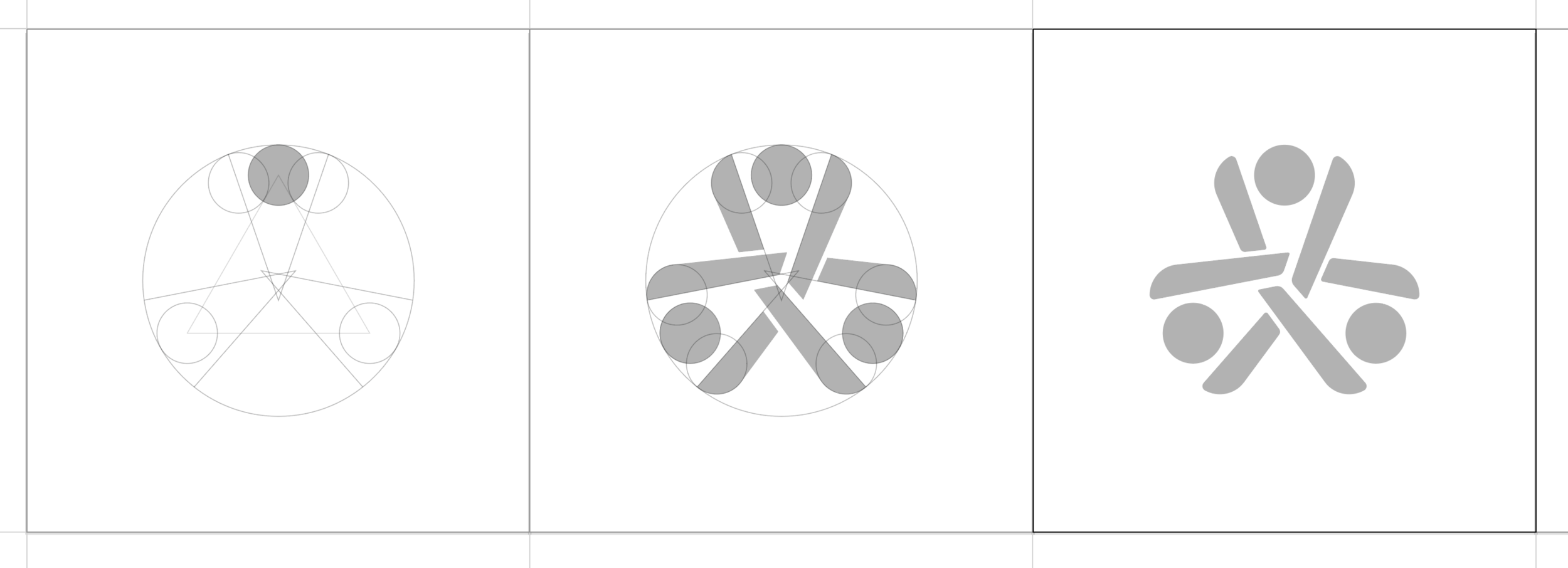
The original logo contained the type lock-up within the mark, which made the scalability of the mark very limited. It looked great large, but when scaled down the text became too small to read. My redesign kept the brand recognizable, but created a clean, scalable mark.
A few images from the process:
Solving a scalability issue of the original logo.
I created a geometric grid, using circles and equilateral triangle to build the mark upon. I tried different proportions and variations within the grid and continued adjusting to get closer to human proportions and harmony.
Designed with Adobe Illustrator.


